
 Order Pickup

Brand manual
Tone of voice
It is all the people returning their empties that make our deposit system the best in the world — not just the machines. Both our words and our images should reflect exactly that.
We have a warm, close voice — one that sounds and reads the same across every channel. We communicate our care for the environment and our contribution to sustainable development.
Solution-oriented – We never present a problem without a solution.
Hopeful – We look ahead to ambitious yet attainable goals.
Credible – We have the facts.
Considerate – What we do, we do for ourselves today and for someone else tomorrow.
Logo
Our logo is the most important identity marker we have. That is why it must be used correctly — with sufficient clear space from other design elements, and at a size that preserves legibility.
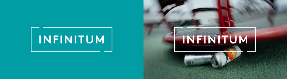
The logo consists of a frame and the name INFINITUM, where the letter N in the middle is a stylised infinity symbol. INFINITUM must always sit inside this frame and may never be used on its own.
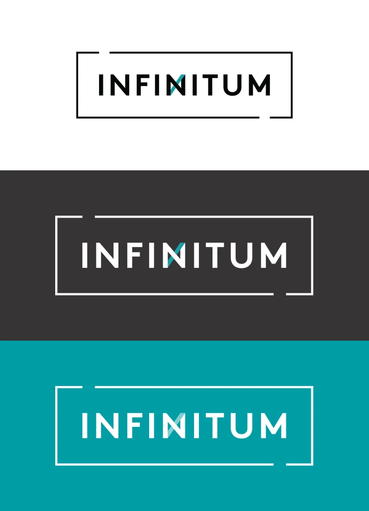
- Positiv
- Negativ
- Negativ 2.0
Logo icon
The icon is a simplified version of the logo. It comes in two versions: a circular one and a square one. The icon must always appear together with our name, or on a surface where it is clear that we are the owner or sender.
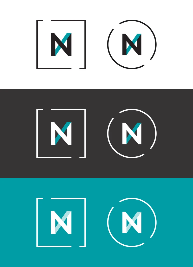
- Positiv
- Negativ
- Negativ 2.0
Using the logo
The logo needs clear space around it to ensure attention and immediate recognition. The clear space around the whole logo must be at least twice the height of the N in the logo.
In cases where the logo or icon has to fit into very small or tight spaces, exceptions can be made. The logo’s legibility will always matter more than the ideal amount of space. Here the designer must use judgement.

Placing the logo
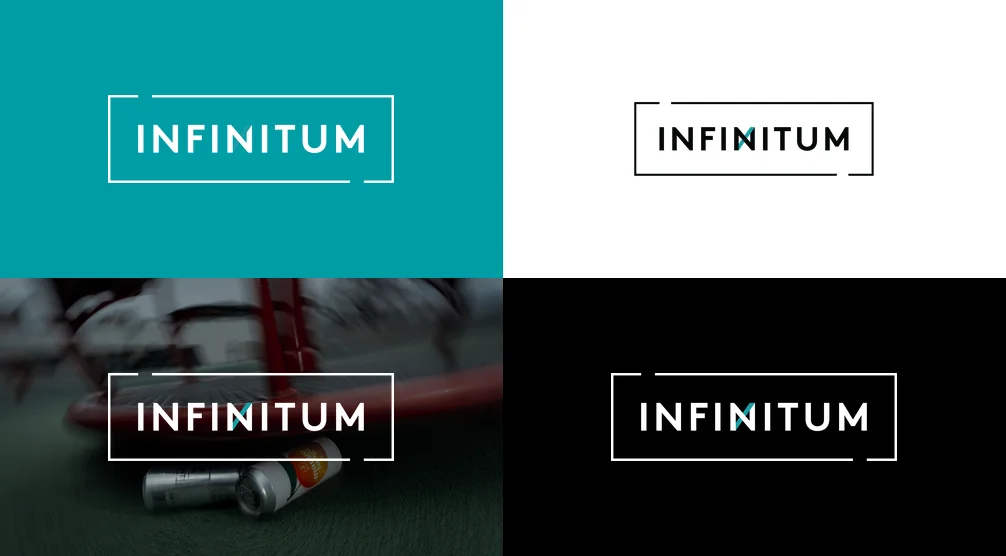
The logo should be placed on a surface that gives good contrast. The logo and icon may be used over images, provided legibility is preserved. Where needed, dark or light filters can be applied to create sufficient contrast. Avoid images with a lot of visual noise, as this can reduce visibility.
Always choose the logo version that gives the best visibility against the background. Pay particular attention to the infinity symbol in the N, which stands out in its own colour.
Sound logo
A sound logo has been developed for Infinitum. It should always be used in productions that include audio. It is mainly used together with the logo in an end frame, but can also be used as a sound effect to reinforce deposit moments in storytelling.
The deposit mark
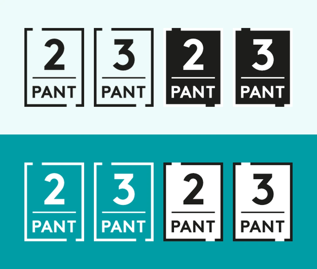
To create a clear link between the deposit marks and Infinitum, we use the same frame and typography as in our logo. The deposit marks come in four versions per denomination, so producers and importers can always find a variant that fits: positive, negative, positive on a white background, and negative on a black background.
Packaging designers can also change the colour of the deposit mark to something that fits their own design. Infinitum must, however, approve such adaptations to ensure the deposit mark stays clearly visible.
The deposit marks also have a minimum size. It is important that this is communicated to designers and others who receive the files for use on their product. They may of course be larger, but the absolute minimum width is 9 mm and height 11.86 mm.
Typography
Arno Pro is Infinitum’s display typeface, used for headings, quotes, standalone numbers, and text that needs emphasis. A licence can be purchased from typekit.com or fonts.com. As a fallback font in cases where we cannot use Arno — for example in email signatures, or open text documents shared with external parties — we use Times New Roman, which is standard on all machines.
Brown is the typeface used for body text. A licence can be purchased from lineto.com. Where Brown is not available, Source Sans Pro is used.
20 May 2026
The world’s best deposit system starts with you!
Infinitum is launching a nationwide campaign that honours you, the consumer. You are, after all, the most important part of the deposit system.
Our deposit system is the best in the world, and it keeps getting better.
– Norway is a world leader in deposit return, and countries all over the world look to us to understand how we did it. They come here to see world-leading technology, innovation and logistics, but the truth is that the system would have no value without the people who actually choose to return their empties, says Randi Haavik Varberg, Director of Information and Marketing at Infinitum.
Colours
We call our signature colour Infinitum Teal (Blågrønn). Together with white and black, this is our primary colour. In addition, we have defined a set of secondary colours that can be used to highlight elements, create unique campaign expressions, or playful illustrations. The colours can be used at 100% or in other shades — 60, 40, and 20%.
Primærfarger
CMYK:
95/0/36/0
RGB:
0/157/165
#009da5
PMS 320
CMYK:
0/0/0/100
RGB:
0/0/0
#000000
CMYK:
0/0/0/0
RGB:
255/255/255
#ffffff
Sekundærfarger
CMYK:
60/0/3/0
RGB:
95/197/232
#5fc5e3
PMS 2985
CMYK:
40/54/0/0
RGB:
167/131/182
#a783b6
PMS 2577
CMYK:
0/79/36/0
RGB:
232/85/113
#e85571
PMS 191
CMYK:
6/0/47/0
RGB:
243/239/161
#f3efa1
PMS 9121
Gradient
In addition, a gradient based on the profile colours has been developed. It is made to give the identity a softer and more human expression, and is used as a background on digital surfaces. The gradient can be used at 60%, 40%, and 20% opacity, giving greater flexibility across different surfaces and formats.
Image style
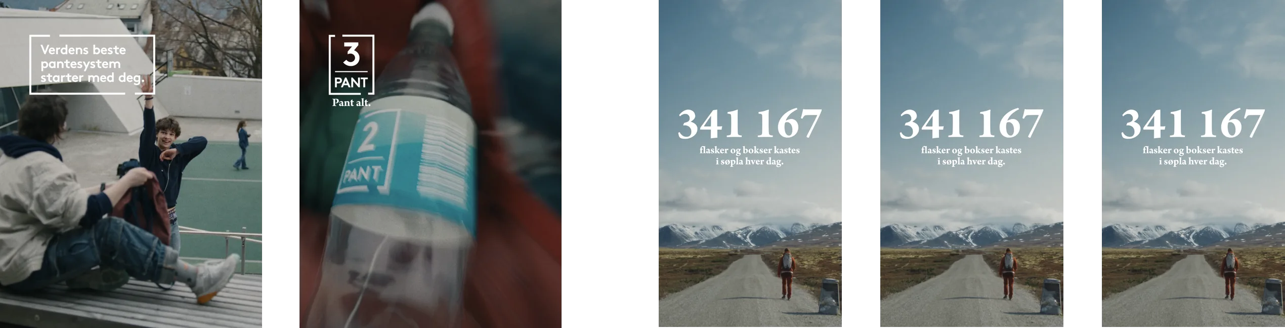
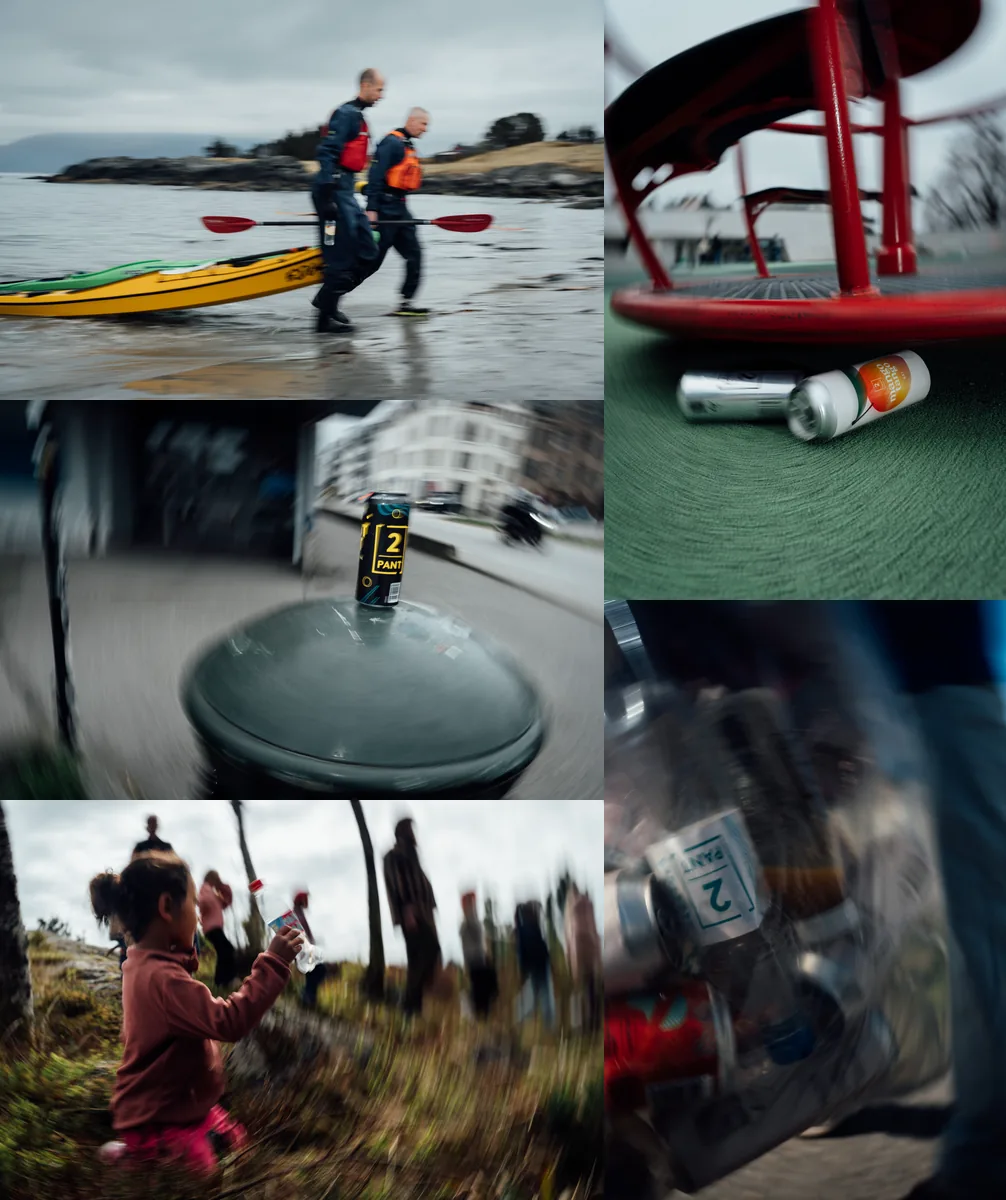
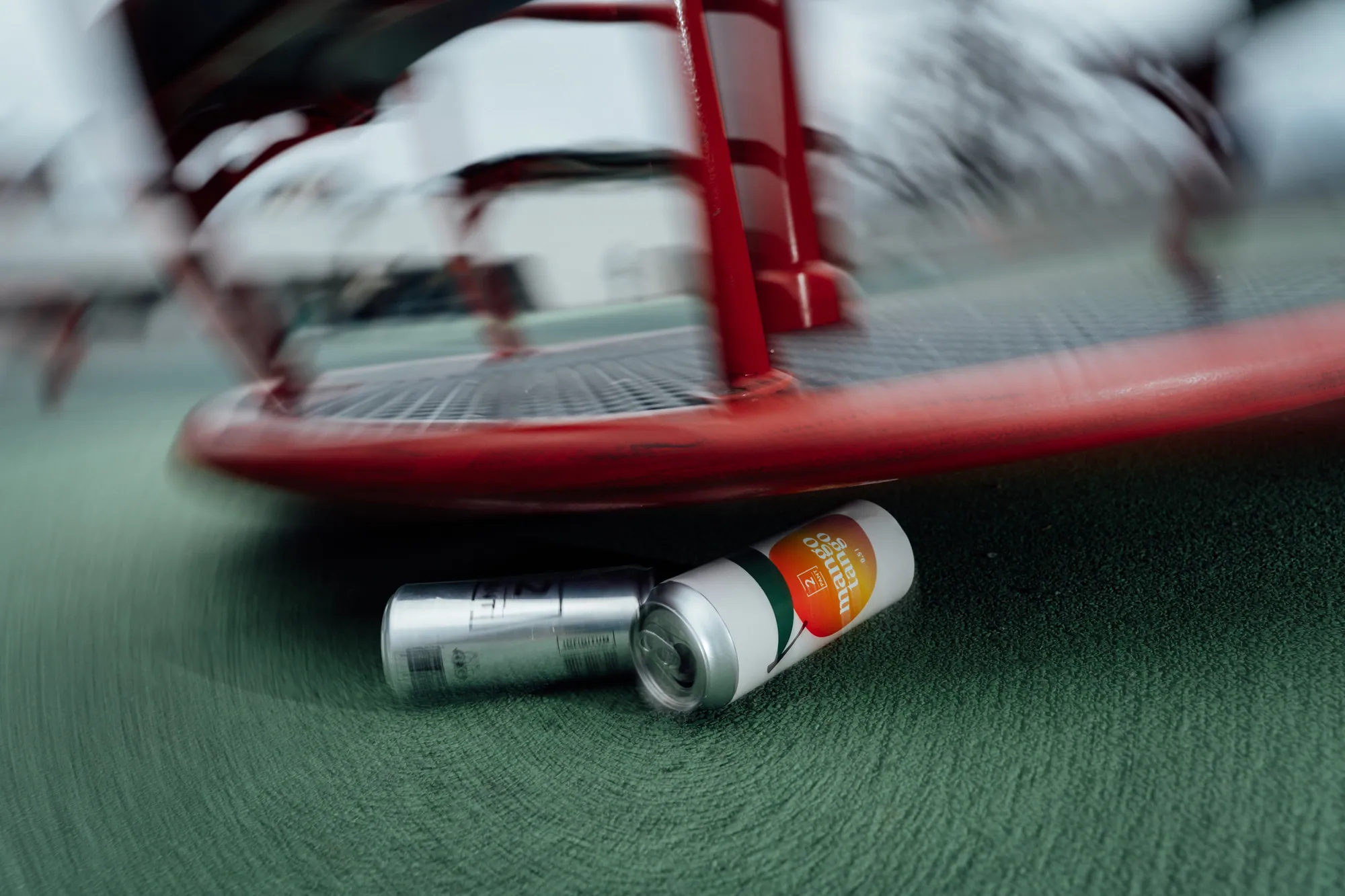
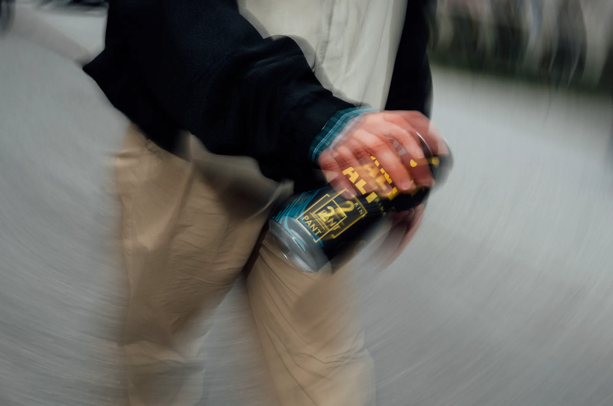
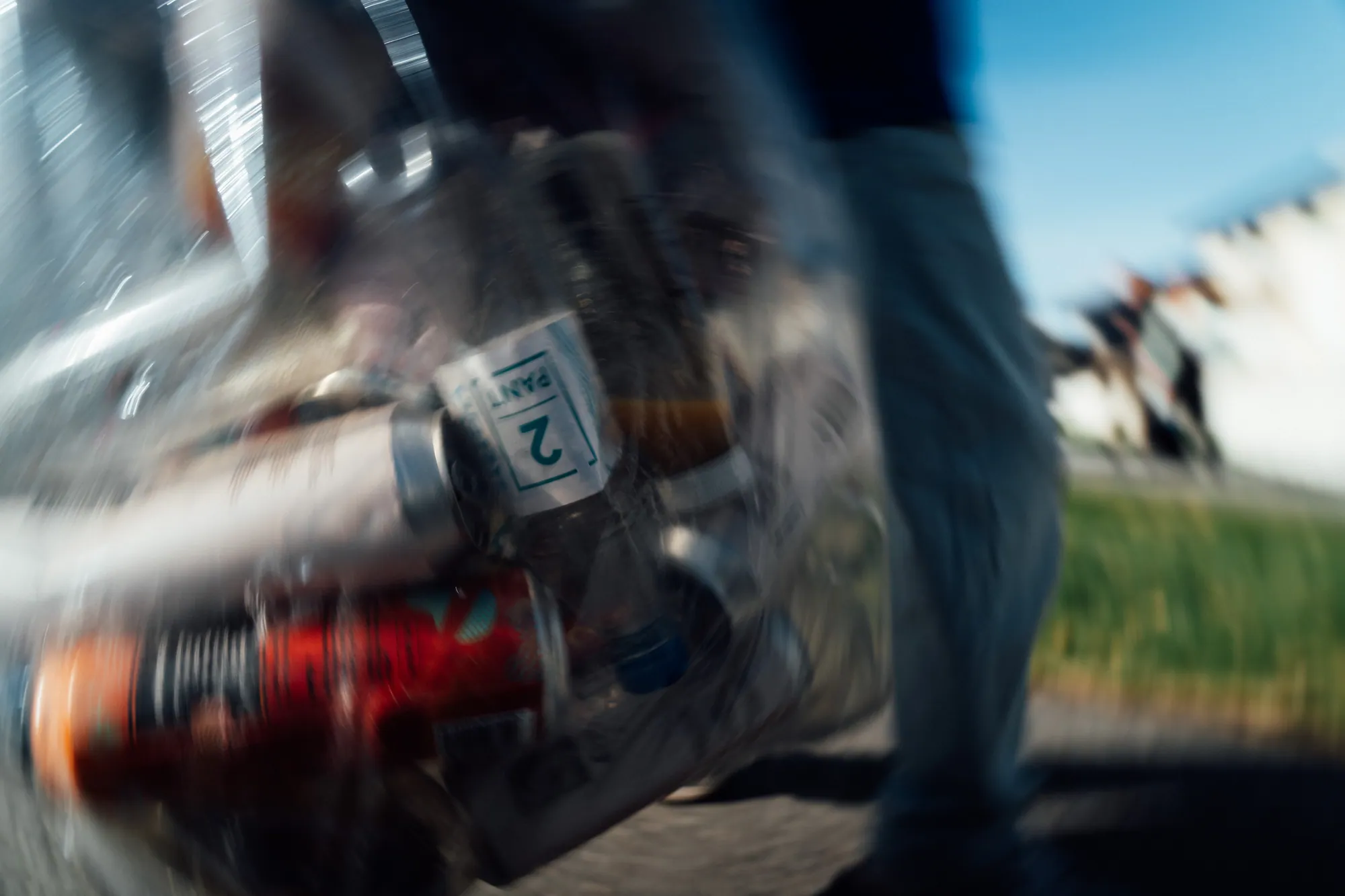
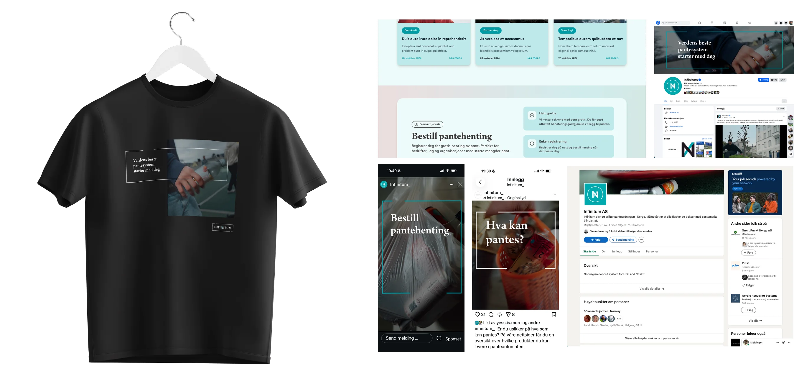
The images in the profile should capture the small, everyday situations where the consumer makes the choices that decide whether a can or bottle ends up in the bin or in the deposit system. The style is documentary, genuine, momentary and spontaneous. The images feel as if they were snapped quickly, almost in passing. Movement has been used deliberately to underline the sense of the moment. Not everything in the image needs to be sharp at once, and slanted compositions, unexpected angles and crops, overexposed elements and backlight have been used to create an imperfect and genuine expression.
The images are taken in different environments that represent typical Norwegian aesthetics — both outdoors in nature and on busy streets, but also indoors in various everyday situations.
It is important that the brands are as unrecognisable as possible, while the bottles and cans still play an important role in the situation. A long shutter speed (motion blur) is a nice effect for achieving this.
Illustration
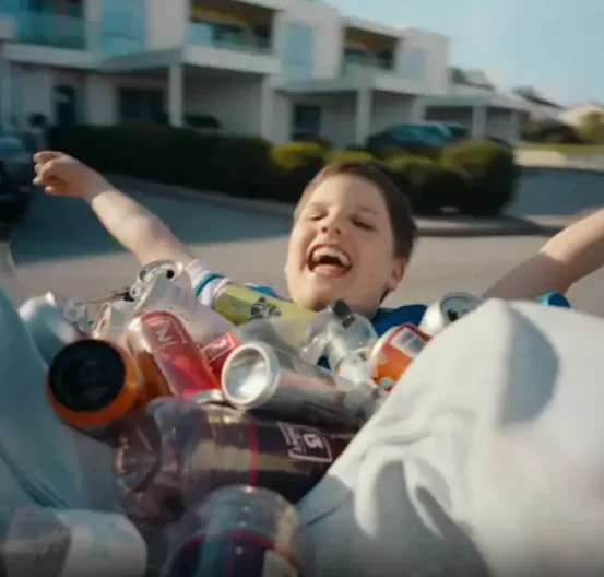
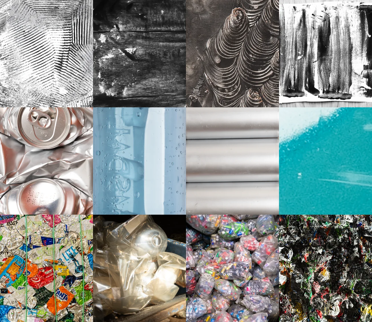
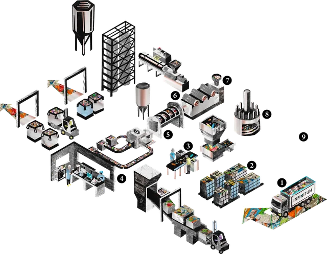
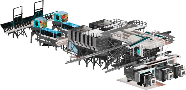
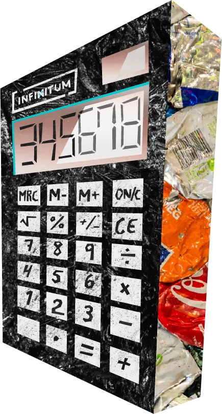
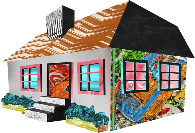
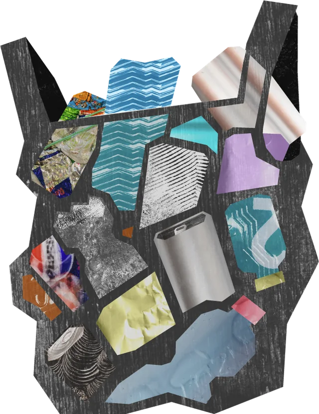
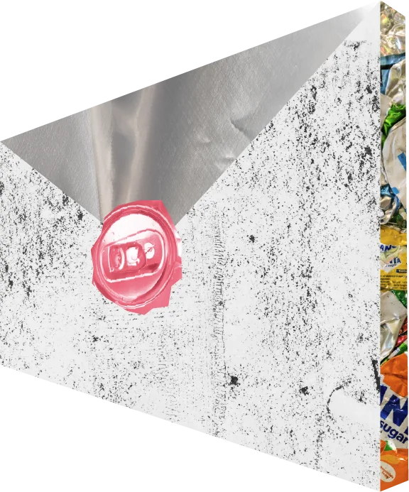
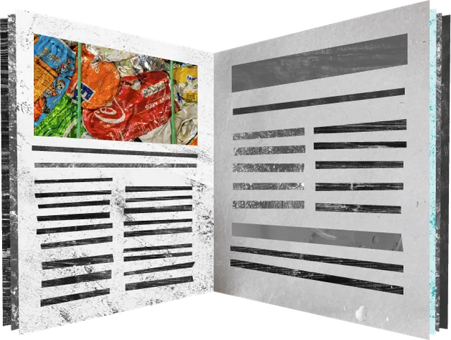
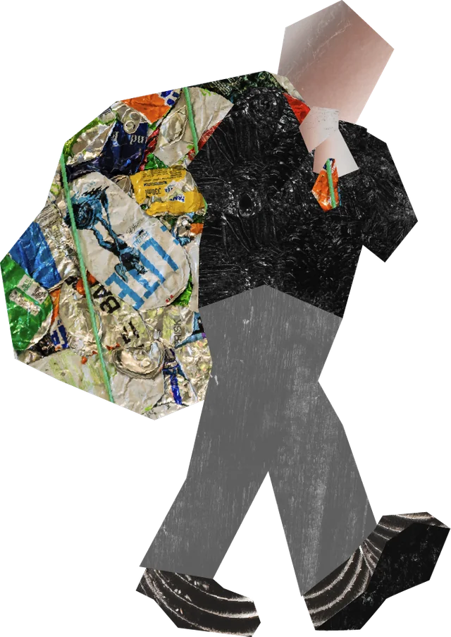
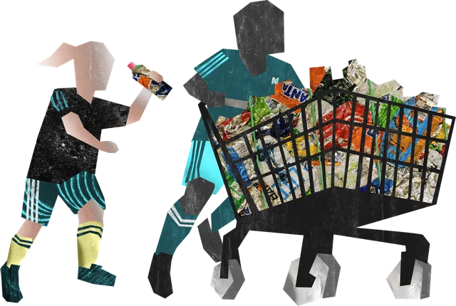
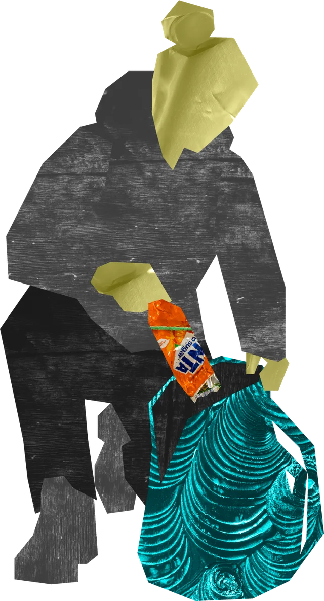
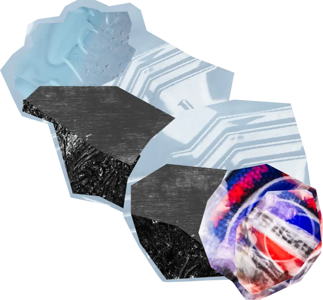
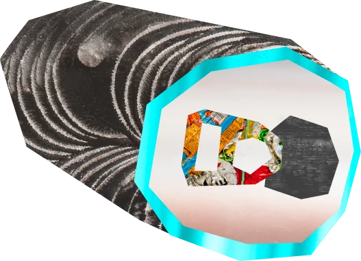
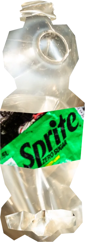
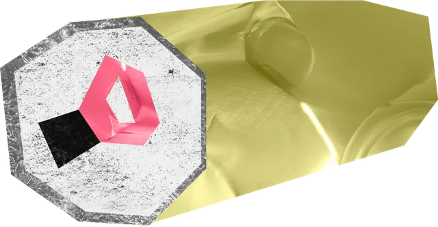
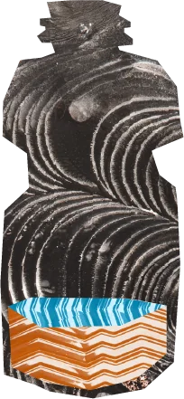
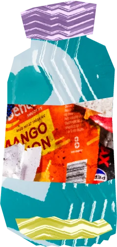
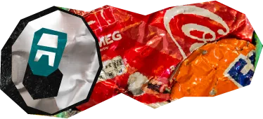
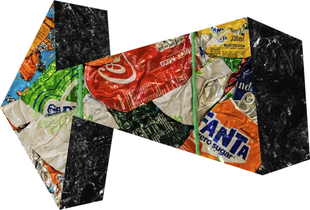
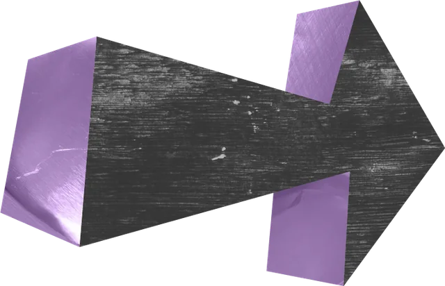
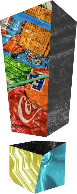
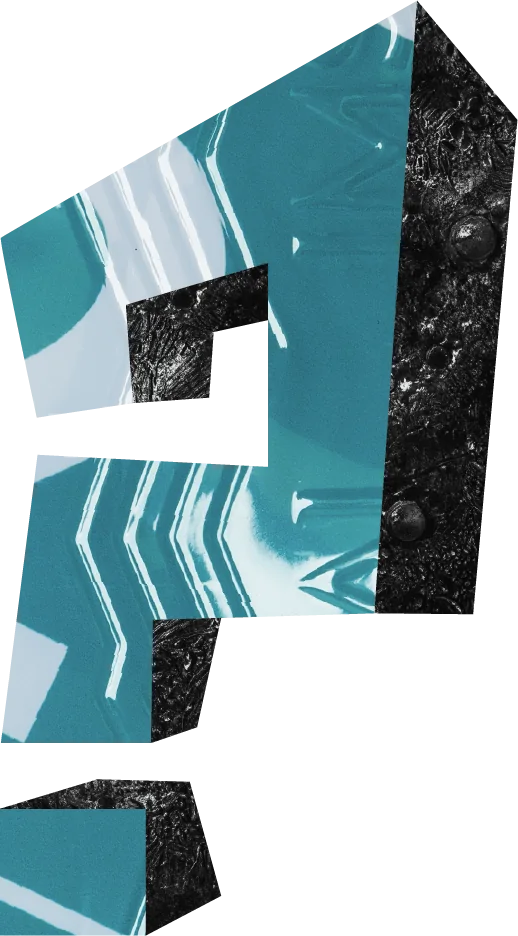
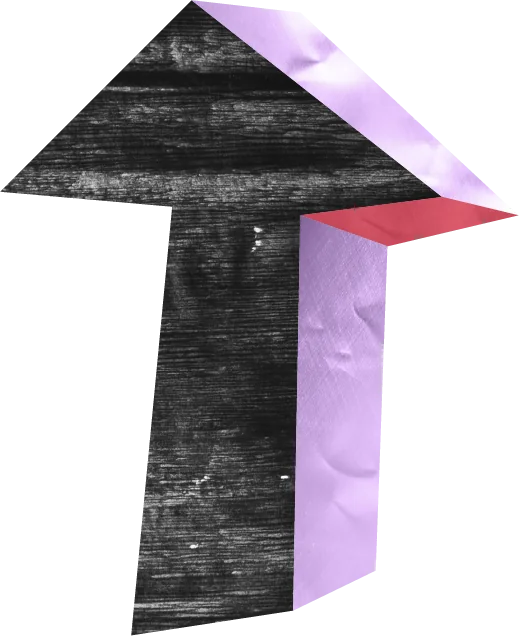
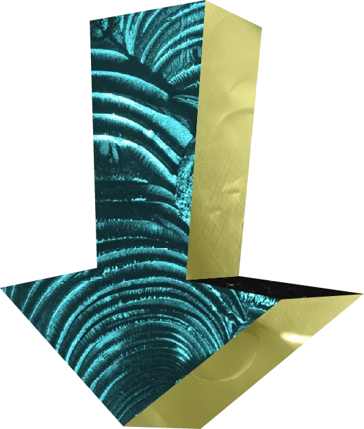
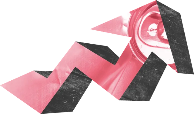
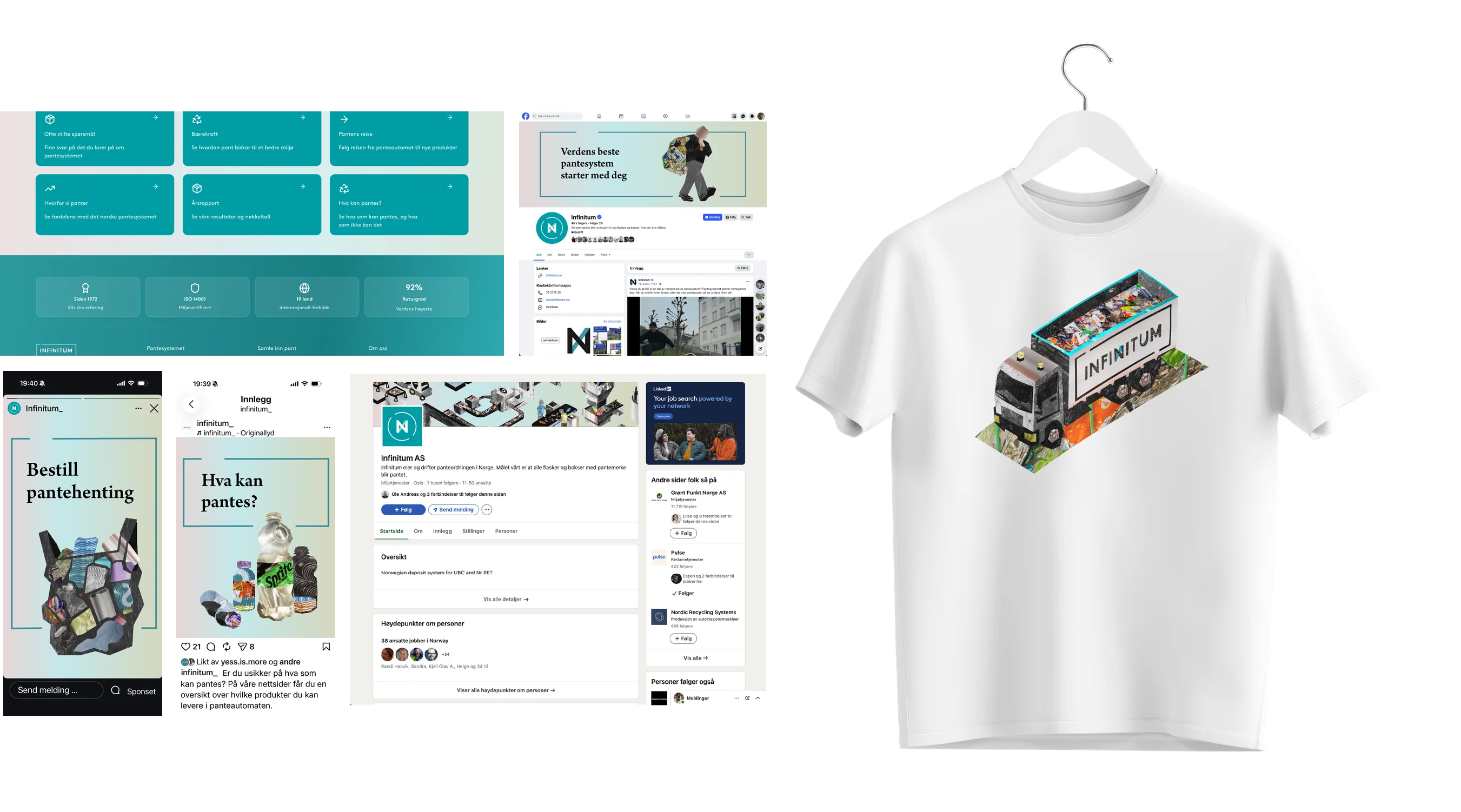
A set of illustrations has been developed to visualise messages and support written content. The illustration style is built up from printed textures and photos of the materials that can be returned for deposit.
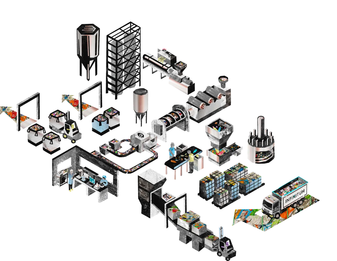
A set of illustrations has been developed to visualise messages and support written content. The illustration style is built up from printed textures and photos of the materials that can be returned for deposit.

The frame
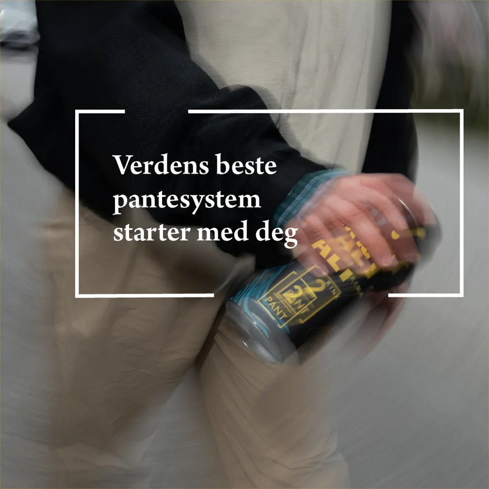
The frame is part of Infinitum’s deposit mark, and represents the system where a product is put in and comes out again as something else. To emphasise the design element, you can place images behind it so that a can or bottle comes out of the frame in the bottom-right corner.
The frame can, for example, tie an image and text together, circle an element, or add character to a plain surface.


Examples in use
Illustration
Photo
Graphics in film